Engaging User Experiences
Interaction and responsive design are vital for seamless and enjoyable user experiences across devices.

Engage
Embrace the Future with Mobile-First Design
A mobile-first design prioritizes the user experience on mobile devices, ensuring accessibility and usability. This approach is essential in today's digital landscape, where mobile traffic dominates.
User-Centric
Interactive Elements

Enhancing User Engagement with Interactive UI Elements
Enhancing User Experience with Microinteractions for Engaging Digital Interfaces
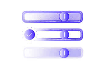
Microinteractions are small design elements that provide feedback to users, enhancing their interaction with the interface. By incorporating subtle animations, we create a more engaging and intuitive user experience.
User Feedback
Engagement Boost

Enhancing Mobile Interactions with Touchscreen Optimization for Seamless User Experience
Enhance Your Site with Parallax Scrolling
Parallax scrolling adds depth and dimension to your website, creating a captivating experience for users. This technique engages visitors by layering content, making navigation more dynamic and visually appealing.

Engagement
Enhance Navigation with Gesture-Based Interactions
Our gesture-based navigation transforms user experiences by allowing intuitive swipe and drag interactions. This approach simplifies navigation, making it effortless for users to explore your content.
Crafting Seamless User Journeys for Enhanced Interaction and Engagement
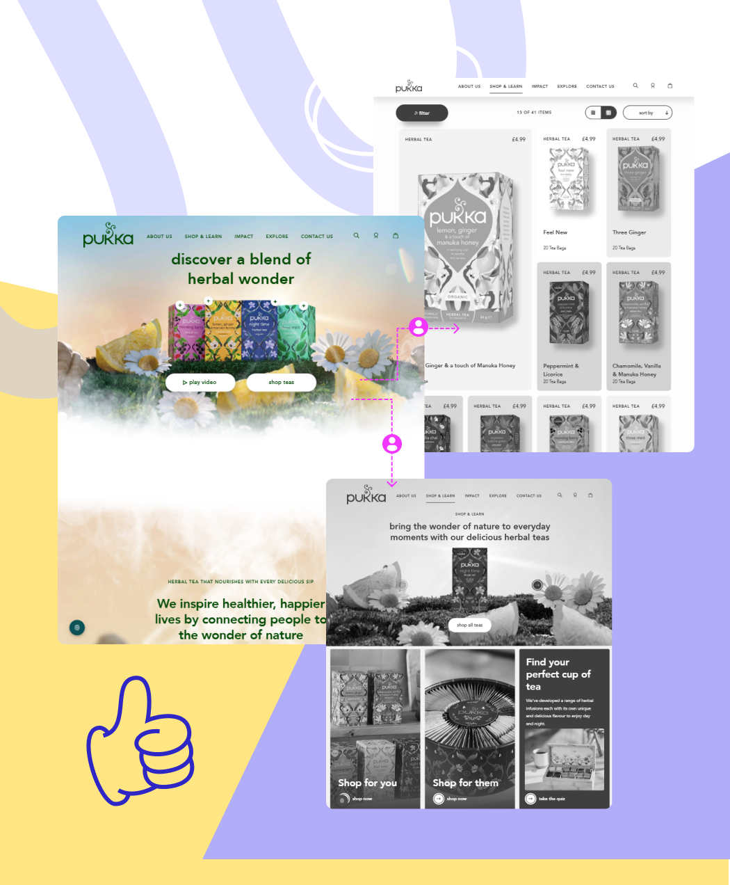
At Digitup, we prioritize user flow mapping to create intuitive pathways for users. Our goal is to ensure that every interaction leads to successful outcomes, enhancing overall satisfaction.
User Journey
Goal Completion

Boost User Experience with Lightning-Fast Site Speed Optimization Strategies
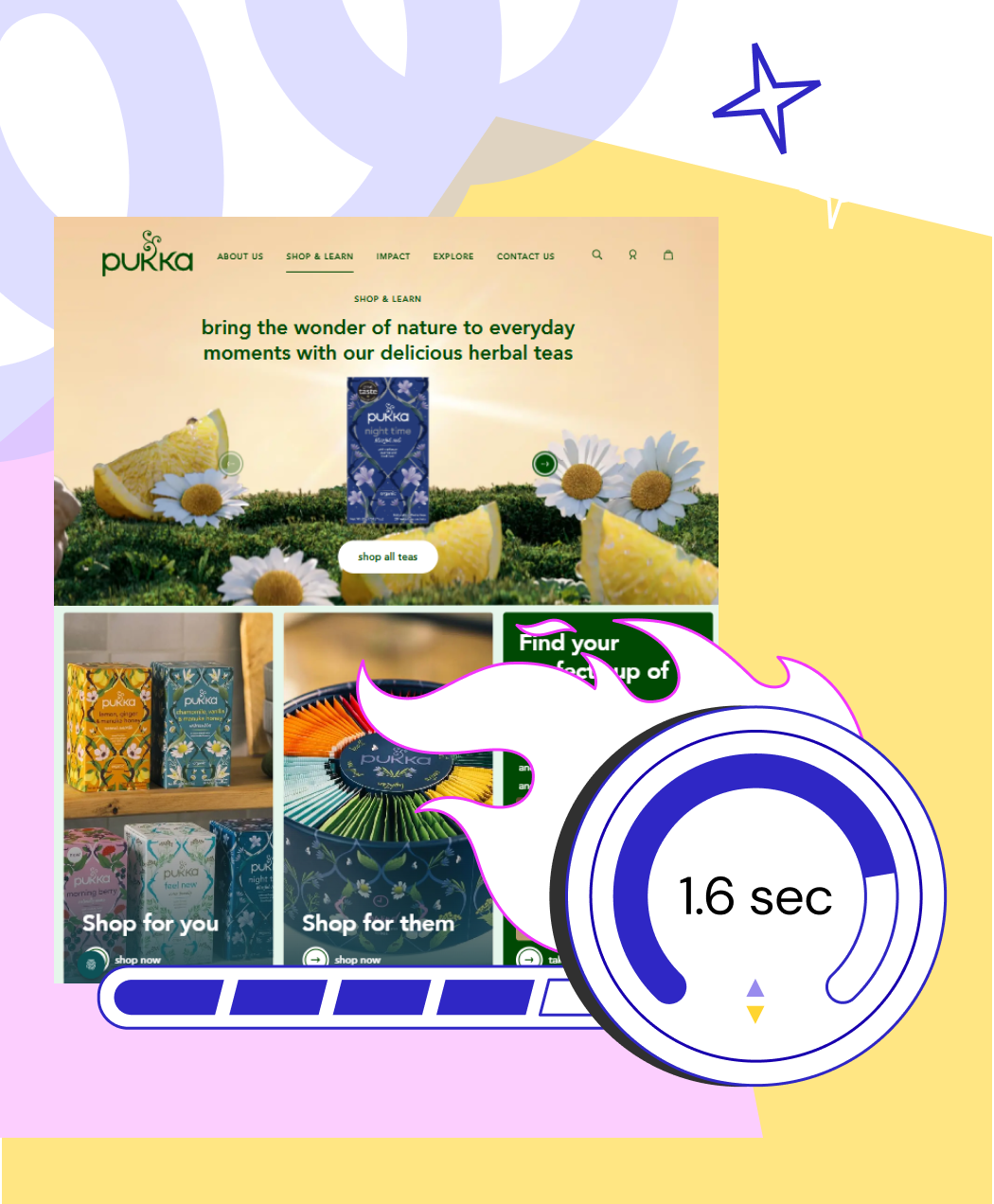
Optimizing site speed is crucial for enhancing user experience and retaining visitors. A faster website not only improves performance but also positively impacts your search engine rankings, driving more organic traffic.

FAQs
Here are some common questions about interaction and responsive design.
What is user experience (UX) design and why does it matter for websites?
User experience design focuses on creating intuitive, engaging, and responsive interfaces that make websites easy to use. A great UX increases customer satisfaction, improves conversions, and strengthens your brand reputation.
What is mobile-first design and why is it important today?
Mobile-first design ensures your website is optimized for smaller screens first, delivering a seamless experience across all devices. With most users browsing on mobile, this approach improves accessibility, engagement, and SEO performance.
How do micro interactions enhance user engagement?
Micro interactions use subtle animations and visual cues to provide instant feedback to users for example, a button animation or a success checkmark. They make interfaces feel more responsive and enjoyable, improving user satisfaction. Discover how we use micro interactions to boost UX.
How does Digitup enhance user flow and navigation design?
Why is site speed crucial for a great user experience?
A fast-loading website keeps users engaged, reduces bounce rates, and boosts SEO rankings. Digitup’s site speed optimization improves load times to under 2 seconds, creating a smoother, more enjoyable experience.
Still have a questions?
We're here to help you with your inquiries.


